Wednesday, August 31, 2011

Using Wireframes to Communicate Information Architecture

Kathy's note: This is the eighth installment in a 12-part series by Theresa Putkey that discusses the intersection of content strategy and user-centred design. Read all posts by Theresa.
___________________________________________________________________

What are wireframes?
As mentioned in my previous Site Maps post, wireframes are akin to a blueprint for a house. For each major page on a website, a wireframe tells you which box should go where, what content should go in the box. You can easily find examples of wireframes by searching for “wireframes images.”

What are they good for?
Since an information architect (normally) has a deep understanding of how users are trying to find information, a wireframe can show others how the information should be laid out so users can best access this information. There are a number of benefits of wireframes, including:
  • Showing layout: for the major pages on the site, a wireframe can act as a template for how the information, images, videos, and forms should be organized on a page. It can also show you how the global and local navigation will appear and behave on a site.
  • Verifying persona needs: With your personas in hand, you can make sure the wireframes represent the most important information needs of the users. For example, a user might need to see a daily financial update announcement instead of the weather. You can ensure this update is in the appropriate wireframe.
  • Fulfilling user scenarios: Scenarios represent what people are doing in “real life” and how the site helps them fulfill their “real life” needs. Wireframes can make sure all the scenarios are satisified. Although the whole scenario doesn’t need to be represented in the wireframes, you can represent the whole scenario or you can represent the more complex parts of the scenario. Ultimate, the wireframe helps you discuss the scenario and see if anything is missing in your design.
  • Verifying requirements: While creating the wireframes, you can refer to the requirements list, then clarify the meaning of any requirements. In the wireframes themselves, you can note which box fulfills which requirement.
How many do you need?
With a site, you don’t need to represent every page in the site map. You only represent the major pages that are significantly different from each other. For example, you might have a content page, a home page, a secondary landing page. If you have any forms or workflows, you can represent these as well. How many you need depends on how many significantly different pages you have and any processes that need to be represented.

What are some challenges?
While wireframes do help communicate the information layout, I’ve run into several challenges with them:
  • Requirements elicitation: Invariably, wireframes always generate more ideas. Instead of being a confirmation of the existing requirements, once people see things on the screen or page, they think of more ideas. This is often called “scope creep.” Often, people don’t have a clear understanding of how detailed the requirements, personas and scenarios need to be and end up fleshing out this detail in the wireframes phase. It happens in every project - I haven’t found a way to avoid it. There should be room for creativity and interpretation in wireframes, but new ideas always elicit a response!
  • More abstract, less concrete: Unlike visual design, wireframes are more abstract. While I use Axure for wireframes and can make them somewhat interactive, people relate to visual design more than they do to the wireframes. Visual design not only adds colour to a design, but it also pulls the eye to certain aspects of the page, gives a better “feel” for the page, and evokes a response based on colour. People respond so much better to visual design, sorry to say. They can agree to a wireframe’s functionality, but once they see the visual design, they get excited. I like to think that the wireframe’s work allows the visual designer to make splendid design.
Conclusion
Wireframes help communicate the information layout for a site. They help the visual designer produce a great design and they speed the development process. While there are some downfalls to them, such as being more abstract and sometimes being used too heavily for requirements elicitation, they do help with agreement on site layout and design.

___________________________________________________________________


About the Author 
 

Theresa Putkey is an information architect consultant living in Vancouver, BC. With a Bachelor of Arts degree from the University of California, Davis,    she focuses on integrating user needs into website and software design projects. She's currently doing her online Masters of Library and Information Science at San Jose State University. You can find out more about Theresa at www.keypointe.ca, or follow her on twitter @tputkey.
Read all posts by Theresa.

Thursday, July 28, 2011

Site maps

Kathy's note: This is the seventh installment in a 12-part series by Theresa Putkey that discusses the intersection of content strategy and user-centred design. Read all posts by Theresa.
___________________________________________________________________

Site maps are something I’ve been struggling with lately. With content dynamically generated, what’s the best way to do a site map? Perhaps it’s best to back up for a minute, explain what site maps are, and then explain my quandary.


What are site maps?
Site maps show the structure of a website. While wireframes are called the “blueprint” of the UX world, I’d say that a site map is more like the electrical wiring diagram or plumbing diagram. These diagrams show you the path that the wiring or plumbing takes through the house. They make sure there’s no wasted materials, no pipes leading to dead ends, no electrical wires not contained in junction boxes.

The site map is used for structuring the pages on the site: it groups the pages into some logical order (based on the user needs or personas for the website). To create a site map, you’ll need to do a content audit or content inventory, deciding on what you want to keep and what needs to be removed. Site map creation can be driven by card sorting and you can test your site map through task testing.

Site maps can be done by either information architects or content strategists. As I see the division:
  • For an IA, the site map is more important for structuring the site properly and creating a representative number of wireframes so the content on the site can be accommodated.
  • For the content strategist, the site map is more important for creating and editing content.
For examples of site maps, do a search for site map images. You’ll find a number of examples.

What are they good for?
Site maps shows you links between pages. The highest level is normally used for the global navigation while the secondary level and tertiary level can be used as sub-navigation items and page links, respectively.

By using a site map, you agree to the site structure before you build it. You know what pages you have and the stakeholders, project team and developers know what should go where. Based on the site map, during the development phase, the content strategist can start creating or editing content to fit onto the pages and continue to revise the site map should it need further modification.

Quandaries
Some issues I’ve experienced in the past include sites that are dynamically created. For example, a page can be created based on a taxonomy. If you take Epicurious.com, they have an infinite number of pages driven from their faceted classification. In this case, a site map cannot express the structure of the site. The wireframes must hold all the information necessary to display information and they must be standardized enough to accommodate the faceted classification. Explaining and agreeing to this structure and functionality with a team that doesn’t understand how faceted classification and the technology works can be quite difficult. I frequently encounter clients who don’t understand the technology driving the websites. While I do explain it to them, there’s always someone else who comes along in the project who does not understand the technology. It’s constant give-and-take between education and progress. You can’t progress and make decisions if clients don’t know how something will work. It’s a constant source of vexation for me because I always have to judge how much someone knows, sometimes I get it wrong. I’m always thinking about how to improve my communication skills so the customer gets what he/she needs out of my work.

Another issue I’ve encountered is what I would call “a site in transition.” For example, some companies need to move their intranet to a new platform, but intranets sites fall into the decentralized control area. Sometimes there are too many sites to move them all at the same time. The site map for the first version of the new intranet might be very small (showing the pages that belong in the first version of the new intranet). But the navigation may still need to lead to these decentralized sites. Not all the sites are carried to the new platform, are on the old platform, look different than the new site. It’s best practice to link navigation to pages within a site and the idea of having landing pages with links has been thrown out. Sometimes the navigation must link to sites that look different. This will cause the user to feel disoriented. It’s also quite difficult to denote these different links within a site map. What pages are on the site? What pages are only in the navigation but not on the site? To solve this problem, I created a site map and a “navigation map,” if you will. 

___________________________________________________________________

About the Author
 

Theresa Putkey is an information architect consultant living in Vancouver, BC. With a Bachelor of Arts degree from the University of California, Davis, she focuses on integrating user needs into website and software design projects. She's currently doing her online Masters of Library and Information Science at San Jose State University. You can find out more about Theresa at www.keypointe.ca, or follow her on twitter @tputkey.


Read all posts by Theresa.

Wednesday, June 29, 2011

Personas

Kathy's note: This is the sixth installment in a 12-part series by Theresa Putkey that discusses the intersection of content strategy and user-centred design. Read all posts by Theresa.
___________________________________________________________________

Creating user personas is a fantastic way to get stakeholders to focus during the design. You’re not just designing for people who like... well, everything... you’re designing for that particular someone who likes to do something particular. I always say, “Ask for what you want and you’ll get it. If you don’t ask, people won’t know what you want.” It’s the same with designing software: if a UX professional doesn’t know what the users want, then they don’t know what are they supposed to design.

For content strategists, personas inform the content needs on the site. You can use personas to tell you what things users are looking for, and you can ensure each content need is met on the applicable pages. You can also use the existing personas and fill them out more to meet your content strategy needs.

What is a persona?

A persona is a single, fictitious person who represents the needs and wants of many people. This representation has been created by information gathered in the user interviews. Personas are a great way to focus the design and to resolve design disputes. The team can focus on concrete people and, when questions arise, they can be asked and answered based on the persona’s needs.

Personals are Built from User Interviews

Personas are built based on user interviews. Whether with a new or existing product, you’ll need to identify different types of people who may use the website or software, then line up interviews with those types of people. If you’re just starting off on the design and interviews, your questions might tend to be more general. If you’re further into the design work, your questions might be more specific and get into more process.

Going Without User Interviews

I’ve worked on “user centred design” projects where user interviews were not allowed. It was the second in a series of projects, each building on the last. For the first project, we had personas, but they were specific to that specific project. For the second project, there was a complete turnover in the team (which also meant educating the new people about UX), and it was determined that the personas for the first project would suffice for the second and user interviews would not be done.

As a UX professional, it was tough to hear that the work I was recommending wasn’t valuable, but it also meant that the second project would lack focus. The user interviews wouldn’t be done and the personas wouldn’t be updated. How do we deal with this refusal?

Here’s a great interview for understanding personas, “Making Personas Work for Your Website: An Interview with Steve Mulder.”

I think personas not based on actual user research are absolutely better than no personas at all. A lot of customer and user knowledge already exists in many organizations, and by looking at the sales, marketing, product, customer support, and tech support perspectives, you can bring all these existing bits of knowledge together into personas without talking to any actual end user.

In this case, turn around the refusal of no user interviews by asking for second-hand information. Companies might feel more comfortable giving this information, since it may be readily available.

In a content strategy project, you may not be able to do more user interviews if the business analyst has already done stakeholder interviews and the UX professional has already done user interviews. In this case, interview the business analyst and UX professional, then look at the secondary sources yourself. Fill out the personas as needed.

How Does a Persona Help Us Focus?

In this interview, Mulder communicates the purpose of personas:

The main thing a persona allows designs teams to do is to think outside themselves and really get an understanding of who it is they are designing for. When design teams build a persona, they write a story about a character that represents a whole type of user that is fundamentally different from themselves. They put themselves in the shoes of their users and think about how the persona would interact with a web site or design.

Have you ever been in a meeting where someone in the room says, “I don’t like this aspect of the design. I mean, my mom doesn’t use this kind of thing, she uses this other thing, so I don’t think this aspect is important.” That’s a great way to take the design off-track. Personas help the team focus on the persona using the product. The conversation can be directed away from that person’s mom and onto the persona with some form of this sentence, “I understand your point, but I want to make sure we’re designing for the personas...”

___________________________________________________________________

About the Author
 

Theresa Putkey is an information architect consultant living in Vancouver, BC. With a Bachelor of Arts degree from the University of California, Davis, she focuses on integrating user needs into website and software design projects. She's currently doing her online Masters of Library and Information Science at San Jose State University. You can find out more about Theresa at www.keypointe.ca, or follow her on twitter @tputkey.


Read all posts by Theresa. 
Tuesday, May 31, 2011

UX Kickoff, Collaboration & Reviews

Kathy's note: This is the fifth installment in a 12-part series by Theresa Putkey that discusses the intersection of content strategy and user-centred design. Read all posts by Theresa.
________________________________________________________________________________________

In my time as a UX professional, I’ve had numerous kickoff meetings, done a lot of collaboration, held a lot of reviews. The kickoff, collaboration and review area all part an overall communication strategy that gets people to agree to the user experience as soon as possible and to help it evolve quickly over time.

In content strategy, you’ll also need to have a kickoff, to collaborate and hold reviews. You can use the thoughts below to make your meetings and work more efficient and effective. The overall point of what I say below: don’t wait until you’re done with the deliverable to get feedback. Get feedback all along so what you present is on-the-mark (or darn near close).

Here’s some problems I’ve had and some proposed solutions for them.

Kickoffs

In January 2011 I wrote a post on my own blog about kickoff meetings. In that blog post, I said,

In recent projects, I’ve been struggling to set the right tone for the project. I mean, the project goes well once we get going, but there isn’t the right kind of kickoff that 1) gets the client excited; 2) sets expectations; 3) educates everyone; 4) builds a team dynamic within this group.

I can’t say that since January I’ve had any further luck with kickoff meetings. I’ve even attended an IA/UX kickoff meeting where were spent 15 minutes on IA/UX and 1.5 hours on a website hosting issue!

What’s really important for UX is to have an actual UX kickoff meeting where the UX people set the agenda, invite the appropriate players, and do the appropriate exercises at the UX meeting. I can’t stress enough how important it is to set expectations up front, to control the agenda, to have something for people to *do* during the meeting, and to let people know ahead of time what is on the menu. Otherwise, people can co-opt the meeting, feel directionless, feel like they weren’t included. Kickoffs are about communication, about making people feel included and making them aware of what’s going on.

Here’s a great post on A List Apart by Kevin M. Hoffman: Kick Ass Kickoff Meetings.

Collaboration

Once you hold your kickoff, it’s time to collaborate. When I used to work in the waterfall development method, I’d sit in a cube for 2 weeks, write a 150 page document, present it for review, have it torn apart, go back to my cube for another 2 weeks and re-do the whole design. It was defeating, humbling, and discouraging.

Collaboration includes brainstorming, card sorting, affinity diagraming, design workshops, anything that moves you closer to understanding each other, getting ideas out there and vetted. You can collaborate in the kickoff meeting, in subsequent workshops, or ad-hoc in the office or over the phone.

When I stepped out of waterfall and became a consultant, I wanted to show my clients that I was working on something, so I started presenting my deliverables earlier and earlier in the design process. I got much needed feedback that I wouldn’t have gotten if I held onto the design till the formal review. I would have spent a lot of time and money doing the initial design, it might have been off base, and I would have spent a lot of time reworking the design (and not necessarily gotten paid for it).

For these reviews, I don’t schedule review meetings with all the stakeholders, but simply talk to other team members to discuss the design, take feedback, update the document. I would also show it to one or two of the more important stakeholders to get initial feedback.

Don’t wait until a design is almost final to present it. If changes are requested, they may not be able to be incorporated or they will take significantly longer to make. Sharing design is a great way to help people feel included and informed.

Reviews

Reviews are tough. I’m an information architect who likes to present a deliverable, give explanations, then take feedback. But I’ve been in meetings where I’ve asked my clients to wait till the end to make comments and have then been told, “Yeah, I don’t work like that, I’m going to give feedback as we go along.” Invariably I get the question, “What about X?” and I say, “We’re just about to get to it.” I can’t communicate my vision, but some people don’t care about that.

Sometimes its best to just give up the explanation of the vision time. People attempting to use a website or web app don’t get an explanation, so if the deliverable can’t be understood without me, is it much good? (Sure sure, there are limits here, but think about the question and think about how you might improve your deliverables to communicate better without explanation.)

On my projects, I like to do paper sketching and silent review periods. I like to get peoples’ impressions without being able to explain myself.

In any case, reviews are meant to gather consensus on the deliverable. Set an agenda for the meeting, have someone take notes, don’t ask people to solution, just ask what they do and don’t like. 

_________________________________________________________________________________________

About the Author
 

Theresa Putkey is an information architect consultant living in Vancouver, BC. With a Bachelor of Arts degree from the University of California, Davis, she focuses on integrating user needs into website and software design projects. She's currently doing her online Masters of Library and Information Science at San Jose State University. You can find out more about Theresa at www.keypointe.ca, or follow her on twitter @tputkey.
 
Read all posts by Theresa.

Friday, April 29, 2011

Information Architecture Deliverables

Kathy's note: This is the fourth installment in a 12-part series by Theresa Putkey that discusses the intersection of content strategy and user-centred design. Read all posts by Theresa.
___________________________________________________________________

In information architecture, there are a few deliverables meant to communicate the information design to all the stakeholders. We’ll discuss some of these in more detail in later posts, but here’s a brief overview of what can be delivered on an IA project and why these things are important.

This list of deliverables is by no means exhaustive. These are some of the typical ones I work with on a project, but I also do stakeholder interviews, user interviews, scenarios, etc. With the links I’ve provided, you can browse through the websites to learn more. 

Content Audit or Content Inventory
A content audit or inventory looks at the content on a website, intranet, extranet or software program to see what is redundant, out of date or trivial and also to see what information can be kept. The audit/inventory can identify the different types of content needing to be accommodated in the site map, wireframes and design. This content audit/inventory is used with any new content needed for the site.

Learn more:  http://usability.gov/methods/design_site/inventory.html 

Taxonomy and Metadata
A taxonomy is essentially a way to categorize content in a content management system or digital asset management system (or records management system, etc.). To create taxonomies, the information architect looks at the existing content and finds the important words, looks at the new content needing to be accommodated on the site and finds the important words, and then creates a structure that spells out these words and their relationships. A taxonomy is a controlled list of terms with one or more terms being applied to each piece of content. 

Metadata helps identify each topic or content part. Metadata can include fields for the file type, author/creator, editor, date created. Metadata is a controlled list of fields whose values are added by the person (or machine) to the content.

A taxonomy is a way to categorize information while metadata is a way to mark up content with more information. Both of these information structures can be used to pull in content onto a site, to dynamically create pages and topics.

Learn more:  http://www.earley.com/webinars/jumpstarts/taxonomy-and-metadata/what-is-taxonomy-and-why-do-you-need-one 

Personas
As I tell clients, personas are “fake people” that help us design for a concrete user. Without a specific audience, we lose track of who we’re designing for and why. If we’re designing for Maria and know that she is more interested in celebrity gossip than world politics, we’ll create a space for her that centres on celebrity gossip. 

Learn more: http://usability.gov/methods/analyze_current/personas.html 

Site Maps
A site map spells out the structure of the site. It can be a very useful discussion point for stakeholders and developers. Stakeholders see how and where their content shows up while developers get information about the structure of the site and how the backend needs to be set up.

The content audit/inventory feeds into the site map. From the audit/inventory, you know what pages you have and what you want to have, so you can create a site map that reflects these pages.

Learn more:

WireframesWireframes show the design of the site without any visual design. It shows how information should be laid out; displays the navigation according to what the site map has specified; uses the taxonomy and metadata to pull information into a site. The personas feed into which content to display and where.

Learn more:  http://usability.gov/methods/design_site/define.html#CreatingaWireFrame 

It’s About Communication
While an information architect can deliver these documents, the work products are more about communication. If a wireframe or site map isn’t communicating well, it’s not doing its job. If everyone understands what’s supposed to be happening, then reams of documentation are not required to further communicate ideas. 

Any first version of a deliverable needs to be used as a talking point. It should never be considered final, but should be considered as useful to progress the design discussion. These deliverables are meant to help communication, so use them wisely.
___________________________________________________________________

About the Author
 

Theresa Putkey is an information architect consultant living in Vancouver, BC. With a Bachelor of Arts degree from the University of California, Davis, she focuses on integrating user needs into website and software design projects. She's currently doing her online Masters of Library and Information Science at San Jose State University. You can find out more about Theresa at www.keypointe.ca, or follow her on twitter @tputkey.
 
Read all posts by Theresa.

Wednesday, March 16, 2011

Information Architecture

Kathy's note: This is the third in a 12-part series by Theresa Putkey that discusses the intersection of content strategy and user-centred design. Read all posts by Theresa.
___________________________________________________________________

In the last post User-Centred Design and Its Processes, we discussed what user-centred design is and how to learn even more. This post, the third in a series of posts, will give you an introduction to information architecture. My approach is to educate those who don’t know a lot about the practice.  

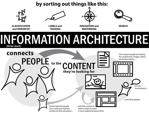
There are a lot of resources that explain information architecture. I view it, essentially, as helping people create context on the Internet, helping them use these spaces better to build community or achieve goals. A lot of people liken it to regular architecture—that to use a space, an architect needs to design the layout and then the builder has to implement the layout. If a builder came along with a plan, you’d get a really bad building! Information architects are much like regular architects, only IAs work with digital spaces.

Here's a short quote from Wikipedia that sums up IA quite nicely, although probably a bit abstractly:
Information architecture is the categorization of information into a coherent structure, preferably one that the most people can understand quickly, if not inherently. It's usually hierarchical, but can have other structures, such as concentric or even chaotic.
Here's a quote from Iain Barker from What Is Information Architecture
Organising functionality and content into a structure that people are able to navigate intuitively doesn't happen by chance. Organisations must recognise the importance of information architecture or else they run the risk of creating great content and functionality that no one can ever find.
These next two items were from an Explain IA contest on the IA Institute Discussion List. (You may not be able to see the Flickr group if you're not part of the group). Here's a great video from Nate Bolt and Kate Nartker that explains IA:


For more about IA, you can also see my review of Andrew Hinton's article.

How Does IA Fit in with Content Strategy?
In the mind of an Information Architect, I see Content Strategists as taking over where IA left off. The IA might design the space, but someone has to fill it with furniture. Content Strategists do the filling. If the IA is particularly good at handling content, then the IA and Content Strategy role can also be combined into one, with the IA designing the space and filling it. The same holds for the Content Strategist: if the Content Strategist can design and fill the space, that’s great. One point of difference that I see is that Content Strategists would be better at content, in other words, better at writing content. IAs would be better at resolving the information interactions happening on the site, in other words, when the user clicks this, it goes here and the expected result is...
___________________________________________________________________

About the Author
 

Theresa Putkey is an information architect consultant living in Vancouver, BC. With a Bachelor of Arts degree from the University of California, Davis, she focuses on integrating user needs into website and software design projects. She's currently doing her online Masters of Library and Information Science at San Jose State University. You can find out more about Theresa at www.keypointe.ca, or follow her on twitter @tputkey.

Read all posts by Theresa.