Information Architecture
Kathy's note: This is the third in a 12-part series by Theresa Putkey that discusses the intersection of content strategy and user-centred design. Read all posts by Theresa.
___________________________________________________________________
In the last post User-Centred Design and Its Processes, we discussed what user-centred design is and how to learn even more. This post, the third in a series of posts, will give you an introduction to information architecture. My approach is to educate those who don’t know a lot about the practice.
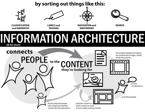
There are a lot of resources that explain information architecture. I view it, essentially, as helping people create context on the Internet, helping them use these spaces better to build community or achieve goals. A lot of people liken it to regular architecture—that to use a space, an architect needs to design the layout and then the builder has to implement the layout. If a builder came along with a plan, you’d get a really bad building! Information architects are much like regular architects, only IAs work with digital spaces.
Here's a short quote from Wikipedia that sums up IA quite nicely, although probably a bit abstractly:
Information architecture is the categorization of information into a coherent structure, preferably one that the most people can understand quickly, if not inherently. It's usually hierarchical, but can have other structures, such as concentric or even chaotic.
Here's a quote from Iain Barker from What Is Information Architecture:
Organising functionality and content into a structure that people are able to navigate intuitively doesn't happen by chance. Organisations must recognise the importance of information architecture or else they run the risk of creating great content and functionality that no one can ever find.
These next two items were from an Explain IA contest on the IA Institute Discussion List. (You may not be able to see the Flickr group if you're not part of the group). Here's a great video from Nate Bolt and Kate Nartker that explains IA:
For more about IA, you can also see my review of Andrew Hinton's article.
How Does IA Fit in with Content Strategy?
In the mind of an Information Architect, I see Content Strategists as taking over where IA left off. The IA might design the space, but someone has to fill it with furniture. Content Strategists do the filling. If the IA is particularly good at handling content, then the IA and Content Strategy role can also be combined into one, with the IA designing the space and filling it. The same holds for the Content Strategist: if the Content Strategist can design and fill the space, that’s great. One point of difference that I see is that Content Strategists would be better at content, in other words, better at writing content. IAs would be better at resolving the information interactions happening on the site, in other words, when the user clicks this, it goes here and the expected result is...
___________________________________________________________________
About the Author
Theresa Putkey is an information architect consultant living in Vancouver, BC. With a Bachelor of Arts degree from the University of California, Davis, she focuses on integrating user needs into website and software design projects. She's currently doing her online Masters of Library and Information Science at San Jose State University. You can find out more about Theresa at www.keypointe.ca, or follow her on twitter @tputkey.
Read all posts by Theresa.


